Juvo Design System
Juvo is a Fintech company that partner with global mobile network operators and financial institutions to give financial identities to the unbanked population in emerging markets.
Role
Jul 2018 - Nov 2018
Product Designer
Team
- Jason (VP of Product)
- Nancy (Design Manager)
- Monica (Product Designer)
- Satindar & Thomas (iOS Engineers)
- Jojo (Android Engineer)
- Youssef (Web Engineer)
- Romy (QA)
- Nimisha (Technical Content)
- Celine (Product Manager)
- Kevin (Technical Designer)
Project Overview
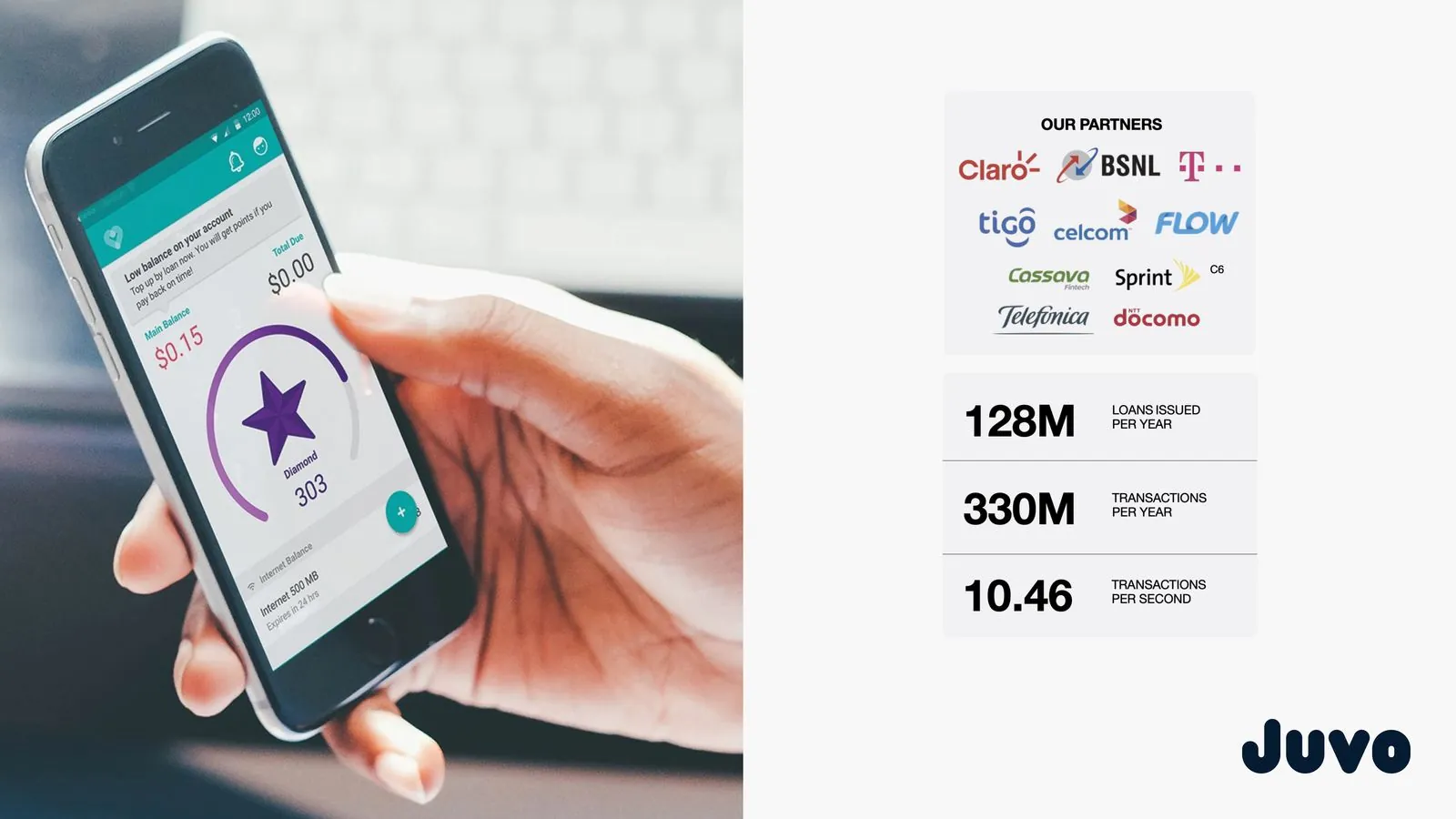
At Juvo, we deploy designs to different markets around the world. We needed to create a flexible design system that would expedite those deployments for all of these different brands.
PROBLEM
Juvo's team lacks a good method for producing and implementing designs
As a designer at Juvo, I've noticed I spent a lot of time recreating screens from our core application to fit our Partner's brand style. We also lacked a streamlined collaboration process between the design and engineering teams. As a result, there was anxiety and implementation delays.
Contribution
Throughout this project, my role was to build a system that document our style and usage guidelines for our core product solution — I created a UI library, wrote documentation, redesigned components, and improved their accessibility and visual design.
CONTEXT
Background
When I joined Juvo I started to noticed some recurring patterns. As a designer at Juvo part of my work was to recreates screens from our core app and re-brand our Juvo product with our Partner’s brand. I felt like we were wasting time doing repetitive tasks, when we could spend more time focusing on way to improve the app experience and building new features…
Challenges
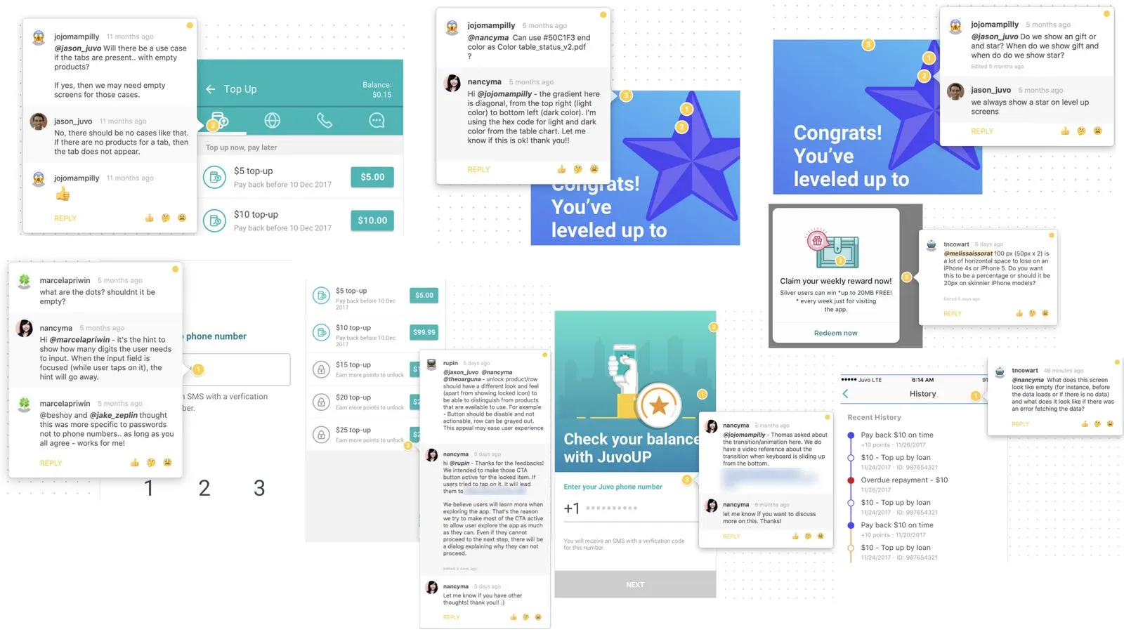
1. We didn’t have a common documentation for our core product.
Although, most of the information can be found in various places like Zeplin, Confluence, JIRA, and Google Docs, the lack of an easily navigable, complete repository for documentation led to a constant flood of questions from the engineering team.
The engineering team was often confused by product/design team choices but did not have an efficient approach for information discovery.
This meant a lack of documentation slowed down the implementation! The engineers spend more time trying to understand how things should be built than actually developing.
2. We spend too much time redesigning the same things.
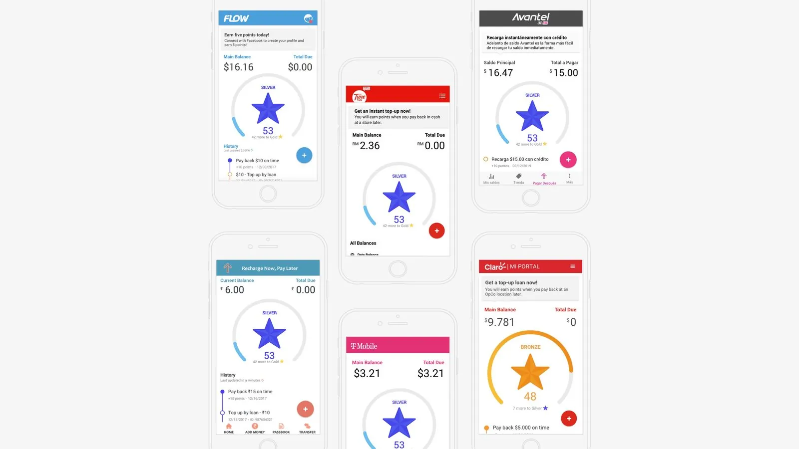
Juvo’s core product is a customizable white-label solution adapted to each of our partners’ brands. This means for every deployment, the design team must create a picture-perfect mockup for each partner screen.
You can imagine this causing significant delays for engineers expecting delivery of these assets.
3. Our partner was often confused by our product solution.
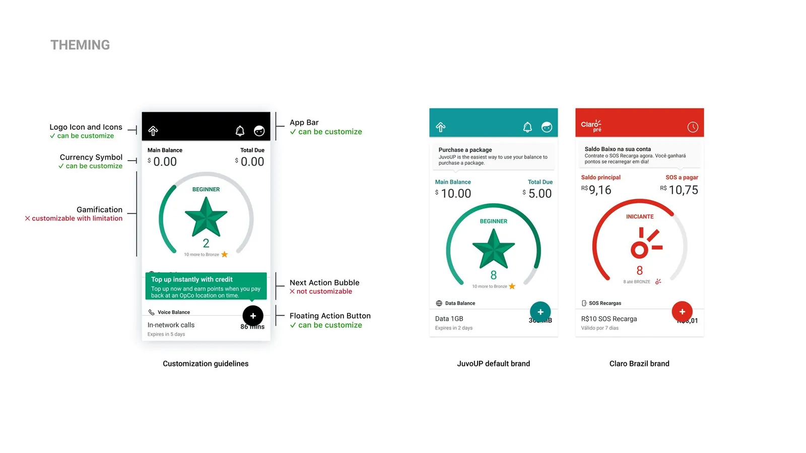
They asked questions regarding the scope of what can be customized for their brand.
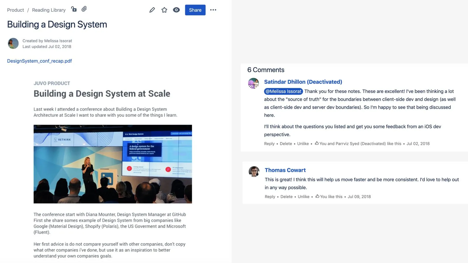
After attending in 2018 the design conference "Building a design system at scale", and doing my own research, I realized how much a design system could improve our processes at Juvo across teams.
I knew in order to implement this design system I would need buy-in from leadership.
So I shared my notes from the conference in Confluence and presented an audit of the existing product screens to the company to highlight inconsistencies and demonstrate the positive impact of a unified UI library. Once key stakeholders were onboard we build a core design system team composed of 10 cross-disciplinary members.
TEAM ALIGNMENT
Goals
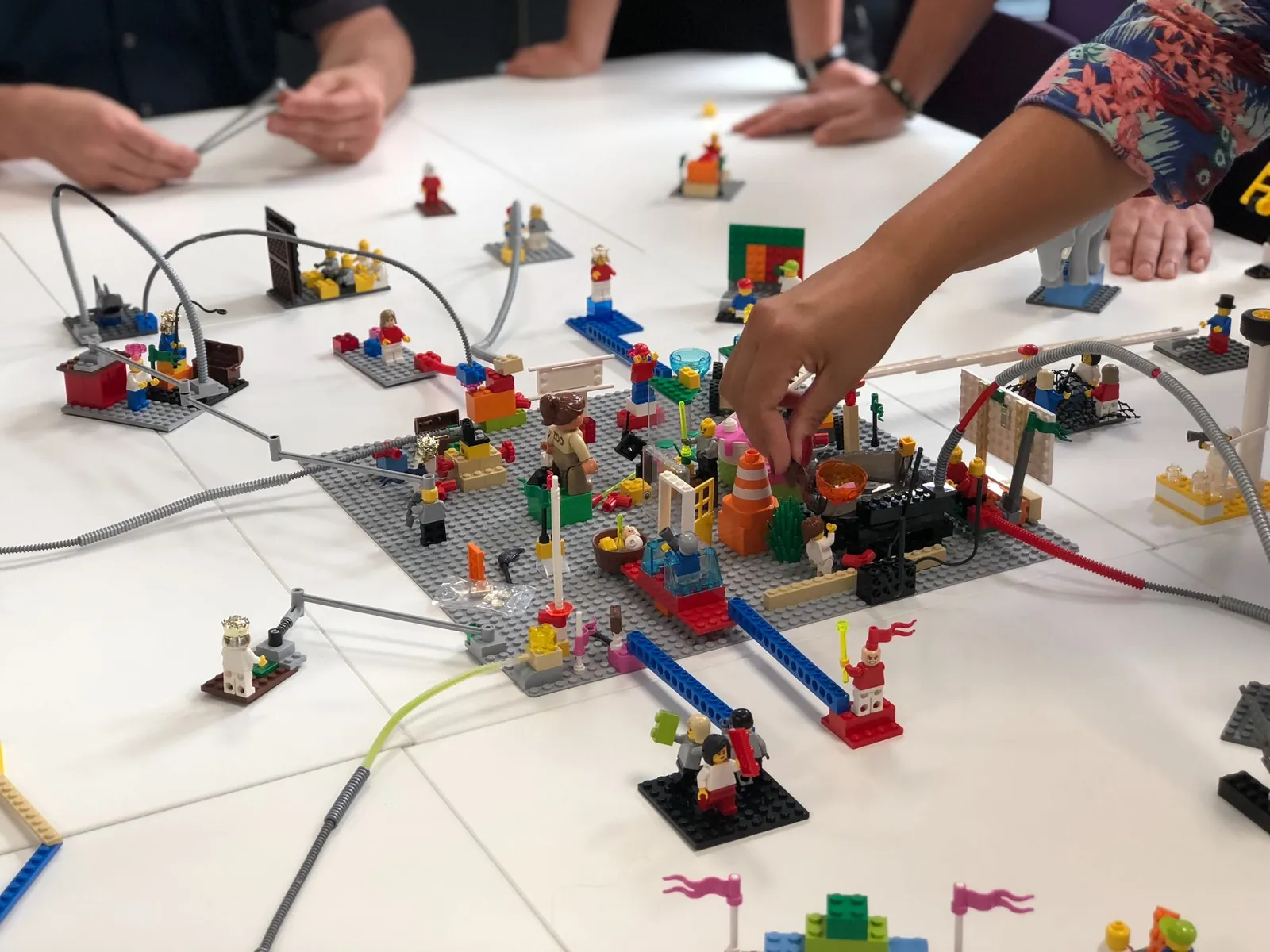
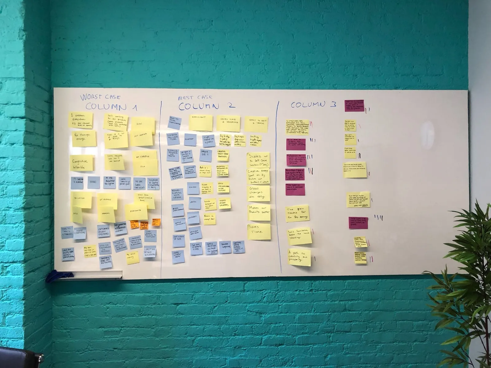
A workshop was held by the design system team to determine the purpose of having a design system at Juvo. We all agreed on the following four goals:
> Alignment
Provide alignment between team by having an official source of truth
> Scalability
Improve our workflow efficiency by providing a systematic way to build things
> Product value
Provide a better way to present and sale our product to our partners
> Creativity
Improve user experience, to increase our product value
Establishing design principles
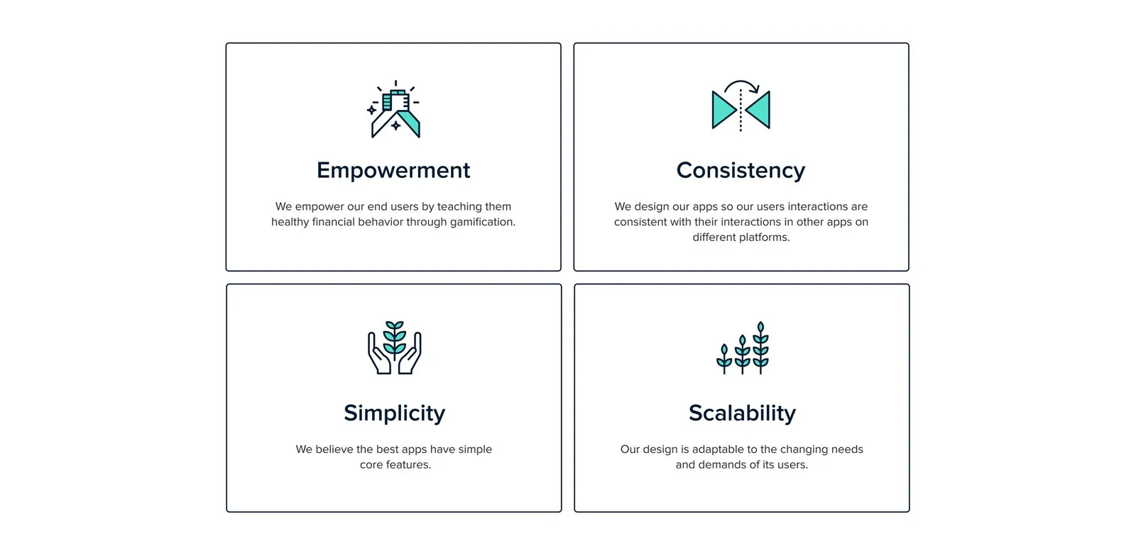
After having our goals in minds, we sat down and brainstormed about the principles that will help guide the project and ensure alignment amongst the team.
We establishes four design principles which are:
PROCESS
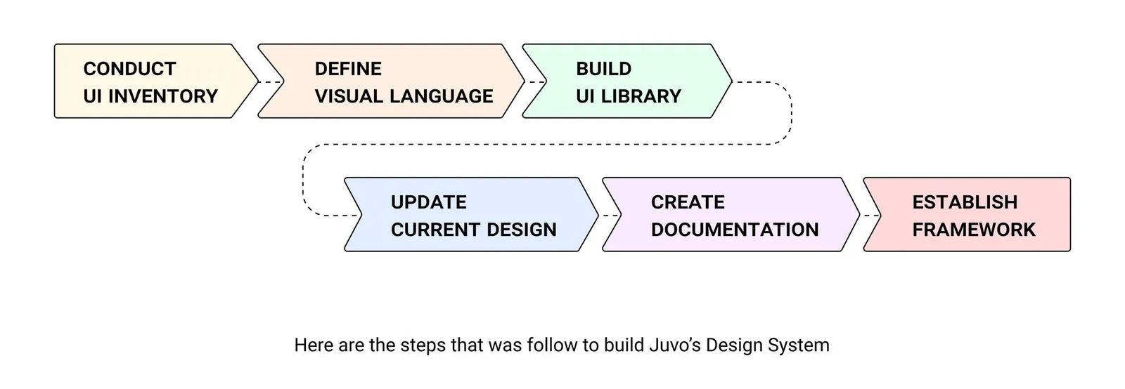
Steps to build Juvo's design system
We began by performing a UI inventory for each of the three deployment platforms (Android, iOS and Web).
Audit
We started by auditing every screen and component for inconsistencies. Eliminating inconsistencies in our design framework allows us to create a more cohesive entity.
The audit helped us uncover irregularities like:
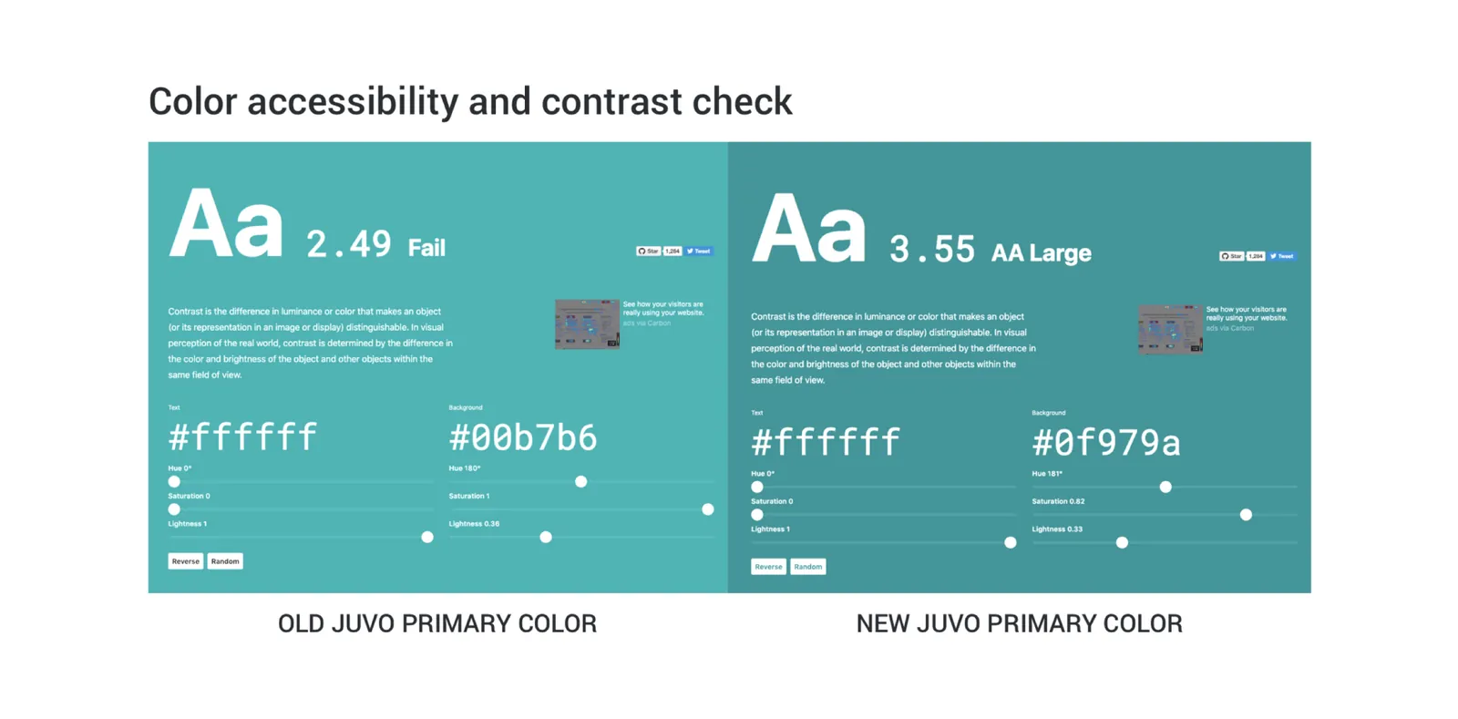
- The color palette didn’t integrate accessibility.
- There was no naming convention.
- There was no spacing system.
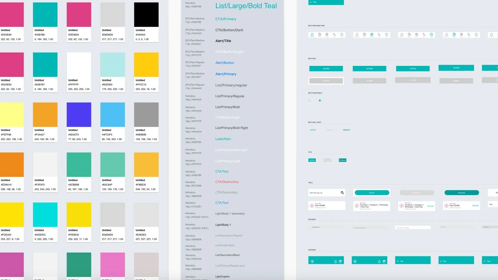
After identifying irregularities, we created solutions. To begin, we focused on the foundations of each component i.e. the color, typography, spacing. These are the elements we are confident will not change for a while.
Color
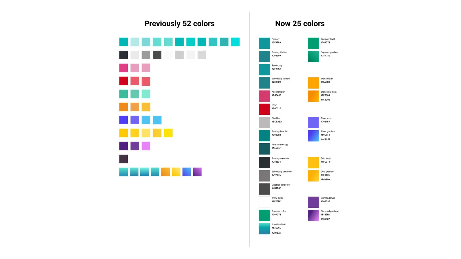
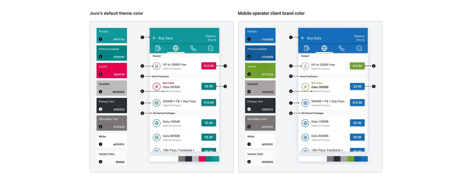
We began with color. The first step was to clearly define the purpose of each color in the product. Our solution is white-label, which means we must rebrand/re-skin our generic branded product with a partner brand identity.
Naming is critical for automating the process. We kept this change simple by naming the colors according to their intended use. This meant categorizing colors as primary, secondary, accent, success, error, and disabled.
Typography
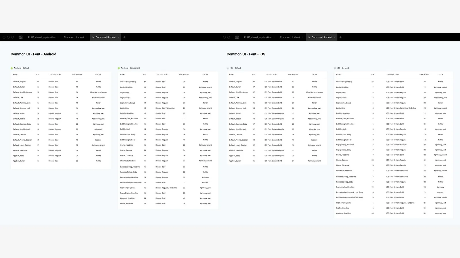
When designing JuvoUp app we decided to uses the Operating System native font family because we want to keep the app light, as our user are cautious of their data usage and live in area with low connectivity.
Using the OS native font, avoid font files storage in the app as we want to prevent performance issue and optimize the user experience.
Layout & Spacing
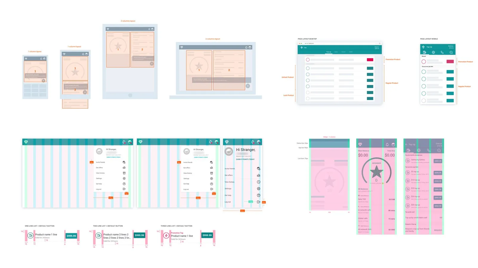
Without a unified grid system in place to define the spacing relationships between elements, it’s difficult to create consistency. When working on a project that required multiple designers, having a defined layout and spacing system keeps pages consistent.
We found using an 8pt grid system to size and space elements on a page allows for device screen size adaptability.
Why 8pt? As both iOS and Android use and recommend metrics that are divisible by or multiples of 4.
Icons & Illustration
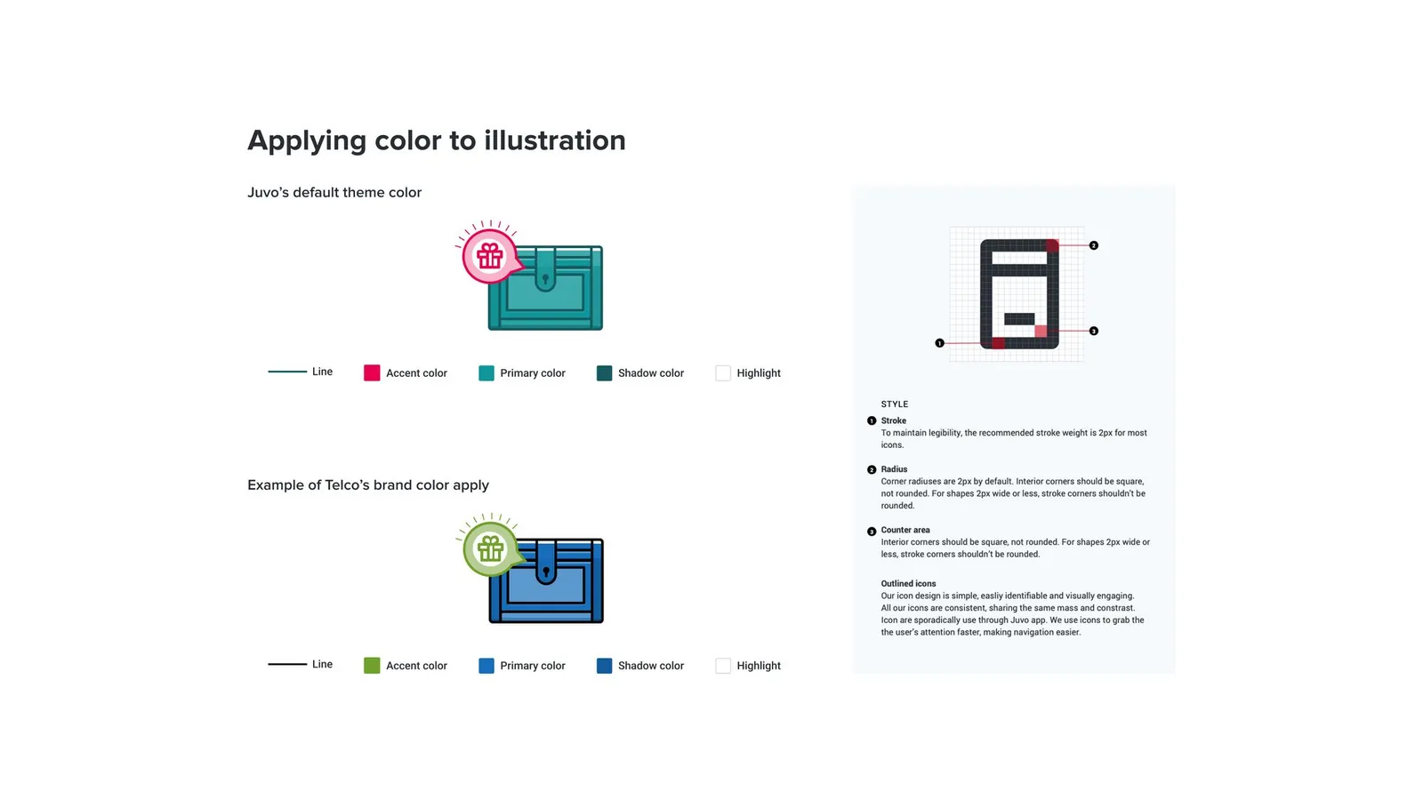
We didn’t have icon and illustration style guidelines. The result was some icons and illustrations were inconsistent in style and didn’t feel like coming from the same family. We unified our icons and illustrations by defining clear guidelines.
We also decided to use SVG format instead of PNG has it allows better scalability, reduce loading time, and have better image resolution. Using SVG icons and illustrations allow us to rebuild our animation library by using Lottie open-source tool instead of using gif.
Naming Convention
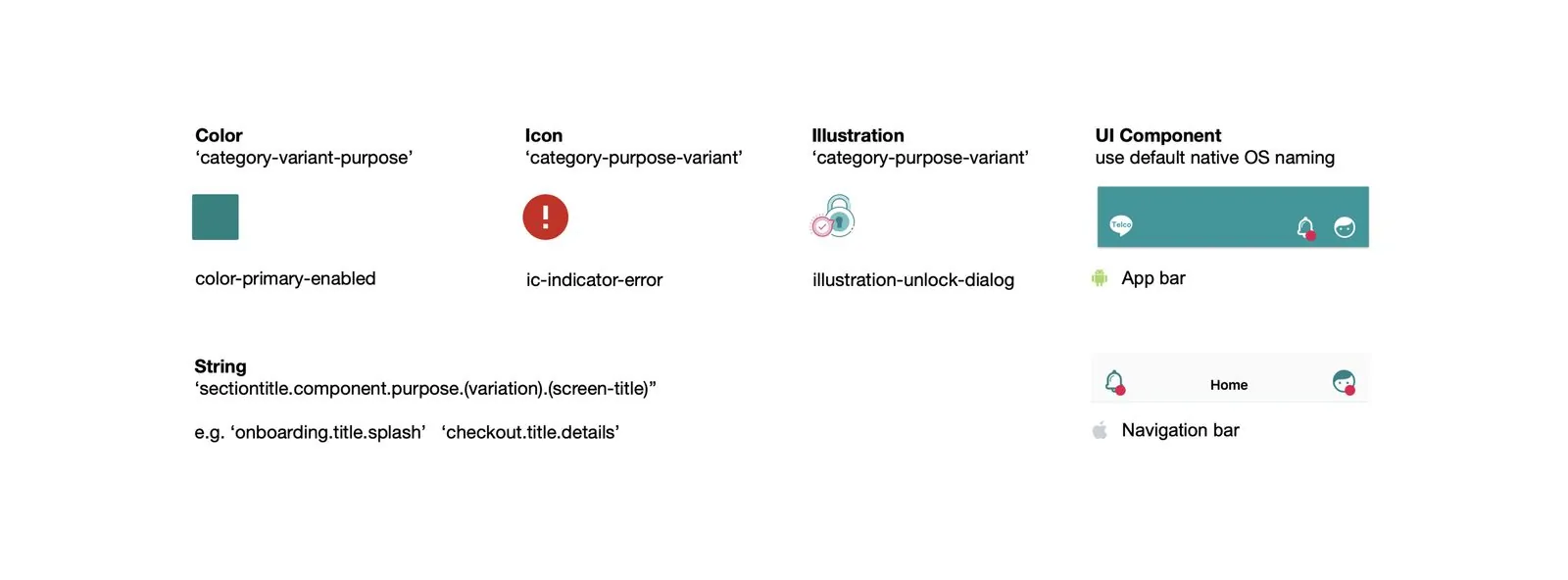
Naming is crucial to automating the process. Having a common design language create alignment and help unite the product as we speak the same language. We avoid confusion, designers and engineers better collaborate as they speak the same language.
Establishing a naming convention helps us with localization. As our screen use english as the default language, we defined key string name to make content translation more efficient.
We used PhraseApp Sketch plugin to sync content translation directly to the design file. Our partner were able to see the design in their native language, and design team were able to ensure that the content fit perfectly the design.
Accessibility
As we create the visual design language and update the design we optimized the UI to be compliant with accessibility guidelines.
Improving the accessibility of the app was an important steps to optimized the app usability experience for those with disabilities but also for our most majority of users with old phone and slow connectivity.
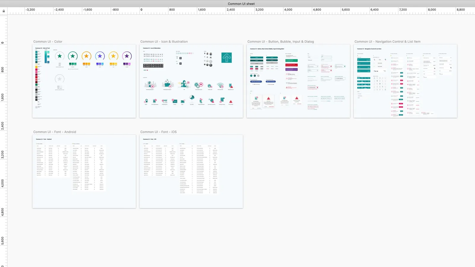
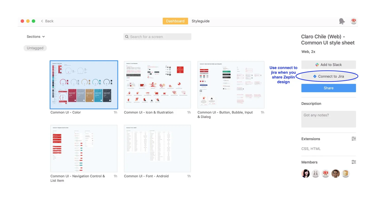
Common UI sheets (Multi-product theming)
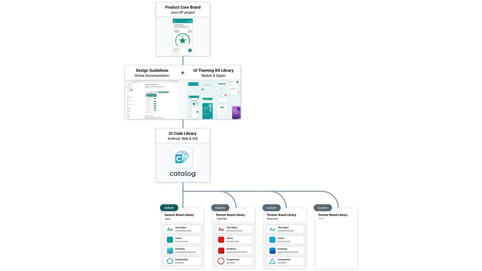
We created a common UI stylesheet for our reference product. Here you can find reusable elements like color, fonts, icons, and buttons that are now easy to re-skin with our partner brands. Engineers can use our reference implementation as a base and customize visual elements to align with partner brands.
Design and Engineering have transitioned to a more efficient process of collaboration. Rather than creating & maintaining mockups for every screen across all deployments, design now only maintains comprehensive mockups for the core reference implementation.
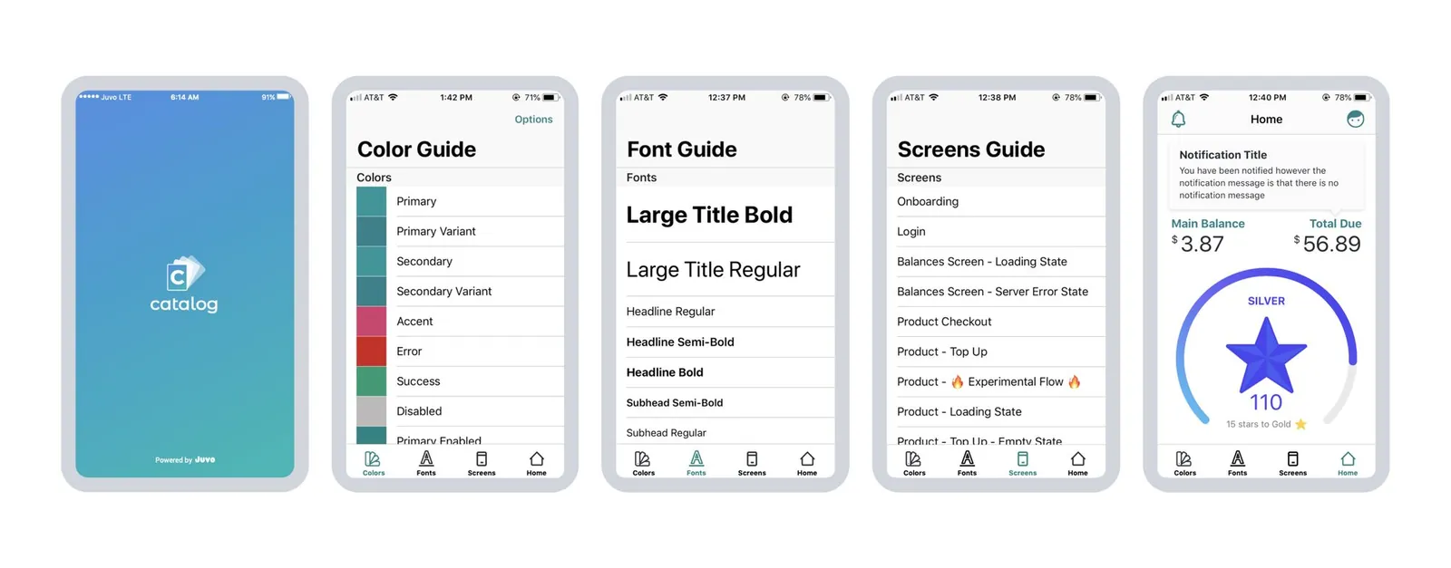
JuvoUP Mobile iOS library tool (Catalog app)
Our iOS engineers contributed to our design system by building an interactive visual library app. This tool catalogs every element, screen, and state found in the core product. The app allow us to play, test, experiment the design in the real environment.
Single source of truth
We used ZeroHeight platform to host our design system documentation.
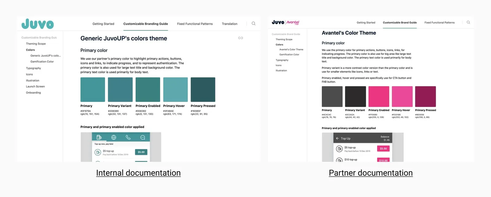
Scaling the Framework
How did we scale our workflow process for multiple brands?
Going from no system to a system…
RESULT
Design System ROI
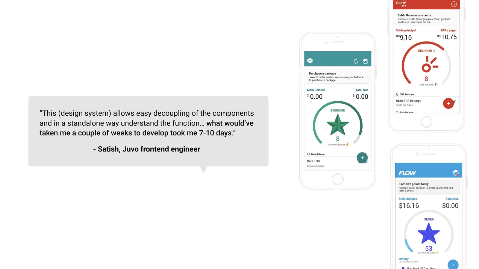
Having a design system helped reduce deployment time from 1 month to 10 days.
Lessons learned
Once the design system is created, the next steps is continued adoption and maintenance.
After the initial creation of the design system, we wanted to step back and reflect on how the design system is best serving Juvo’s teams. The design team has run a series of interviews to better understand stakeholder needs. We wanted to make the process more inclusive and create a sense of shared ownership.
To solve the pain points and issues that we identified, we created a dedicated working, co-creation design system group. The primary goal of the product design system is to improve collaboration between engineering and design and ensure the system stays aligned with our product so it continues to evolve and grow.