Skip to content
Work

GLIDR Branding

GLIDR is the complete innovation portfolio management solution for lean innovation. GLIDR provides the tools required to build, and sustain continuous lean innovation for the enterprise. GLIDR helps you build, measure, learn, validate ideas, to make better decisions.

White GLIDR glider symbol and GLIDR wordmark with "by launchpad" on a cyan-to-purple gradient

Role

Art Direction, Brand Identity, Graphic Design, Illustration, Keynote Presentation

Company

Glidr, year 2016
glidr.io

Challenge

Design the logo and brand identity of Launchpad Central's new web application GLIDR.

Approach

For the visual elements of the brand, we wanted to emphasize the more direct implications of the business. We aimed to convey velocity, growth, and momentum in a minimalistic, sleek way. We choose the glider as a metaphor to represent the product. GLIDR appeals to all three personas (team, middle management, and senior leaders) because of the ability to achieve a sense of direction, navigate altitude (perspective), and natural forces, combined with a sense of freedom.

Process

After a brainstorming session about GLIDR's main benefits, characteristics, and values we defined the personality traits, and a brand story to create a foundation to introduce creative direction. I started with a large exploration of what the primary idea could be. I sketched a large number of shapes from literal to very abstract concepts. An abstract shape enabled more flexibility, liberty, and can be universal, and timeless.

Solution

The symbol is very simple, identifiable, and minimalistic. It represents the abstract triangular shape of a glider. The lines add rhythm by evoking the air (natural forces that help navigate, maintaining altitude, a multi-level view (short and long-term perspectives), a sense of direction, motion (exploring ideas), and freedom (make innovation, and collaboration open, free, and agile). For the typeface, I used a customizable version of Andis-Light. Combined with the glider symbol, the font adds function, expression, and a touch of humanity.
The logo communicates GLIDR's values; free, open, and agile. We also wanted to communicate our intention to enable innovation through the exploration of ideas via testing, and validation.
The vibrant bright color palette induces warm and friendly energy, suggested by making connections, and collaborations.
The colorful palette conveys dynamism, and energy implied by constant adaptation.
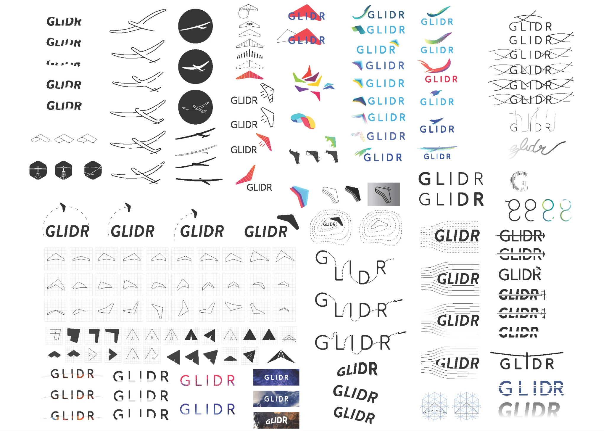
Logo exploration board: dozens of sketched and digital GLIDR wordmark and glider-symbol studies, from line-drawn gliders and black circle icons to colourful abstract marks and hand-lettered, crossed-out wordmarks
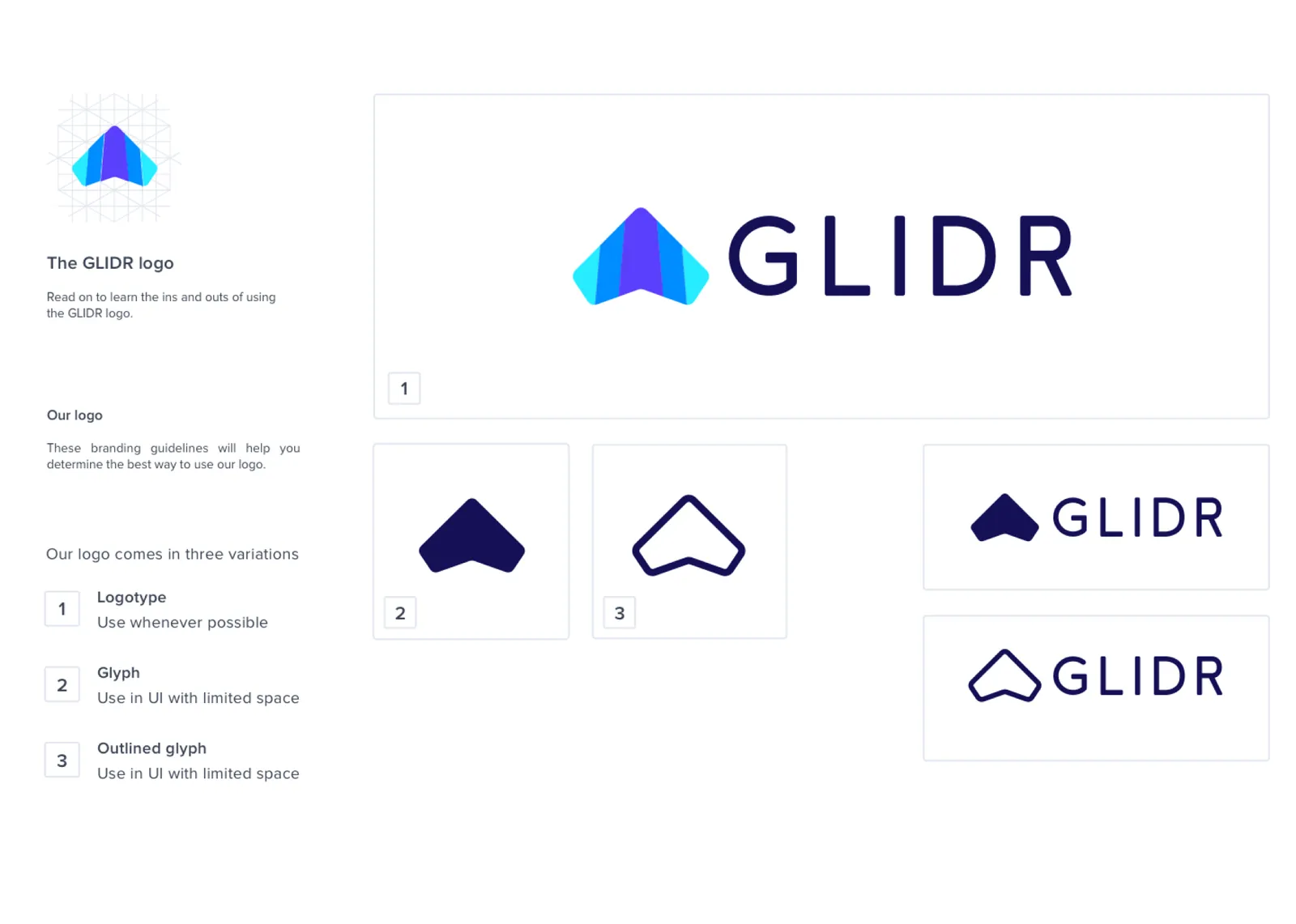
GLIDR logo guidelines, "Read on to learn the ins and outs of using the GLIDR logo": the gradient glider symbol on a construction grid and the logo's three variations in numbered tiles, 1 the full-colour logotype (use whenever possible), 2 the solid glyph and 3 the outlined glyph (both for UI with limited space), with two navy horizontal lockups
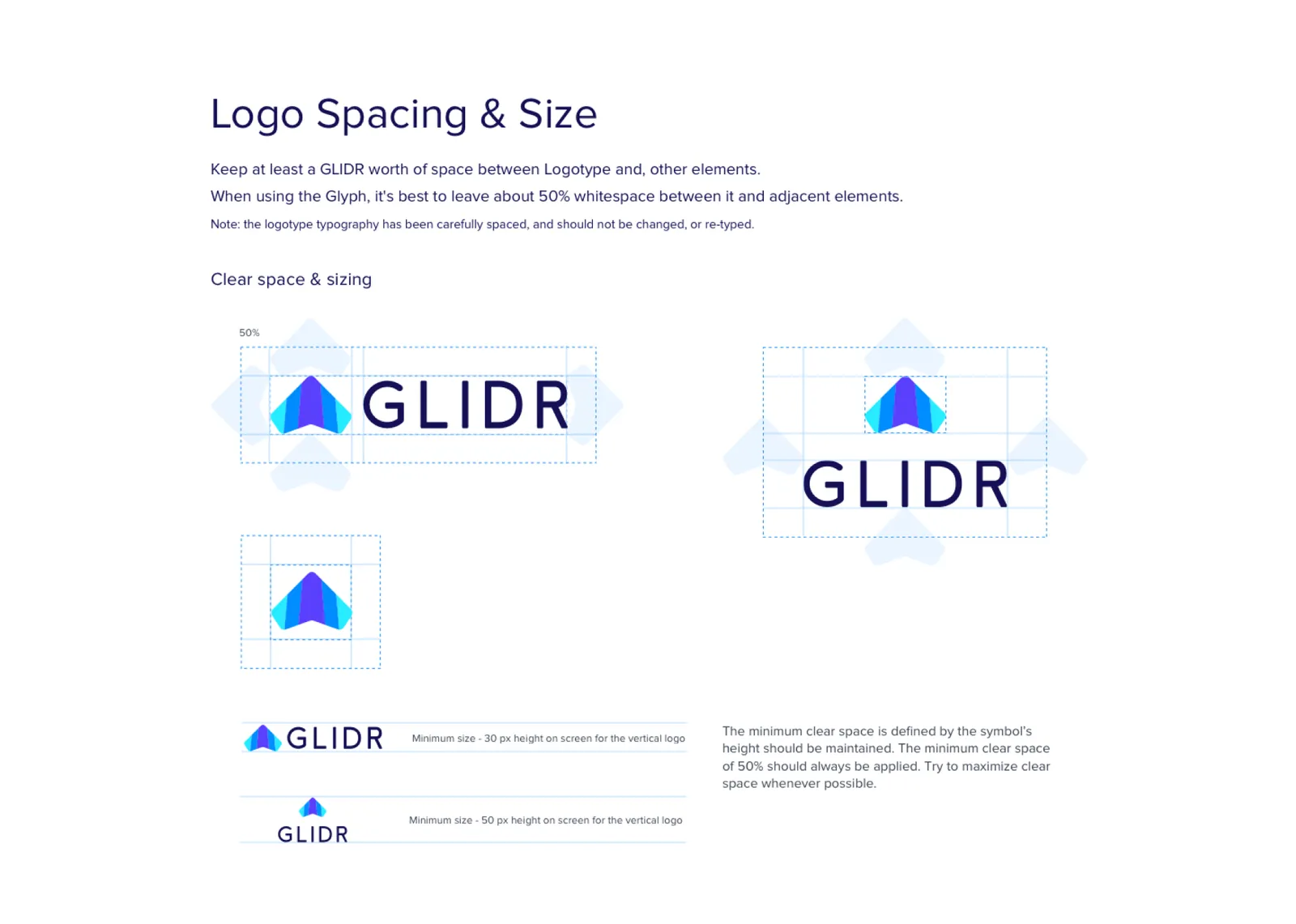
Logo Spacing & Size: keep at least a GLIDR worth of space between the logotype and other elements, and about 50% whitespace around the glyph; the logotype's letter spacing is not to be changed or re-typed. Horizontal and stacked GLIDR logos in dashed clear-space boxes marked 50%, the symbol alone in a grid, and minimum sizes of 30 px and 50 px height on screen
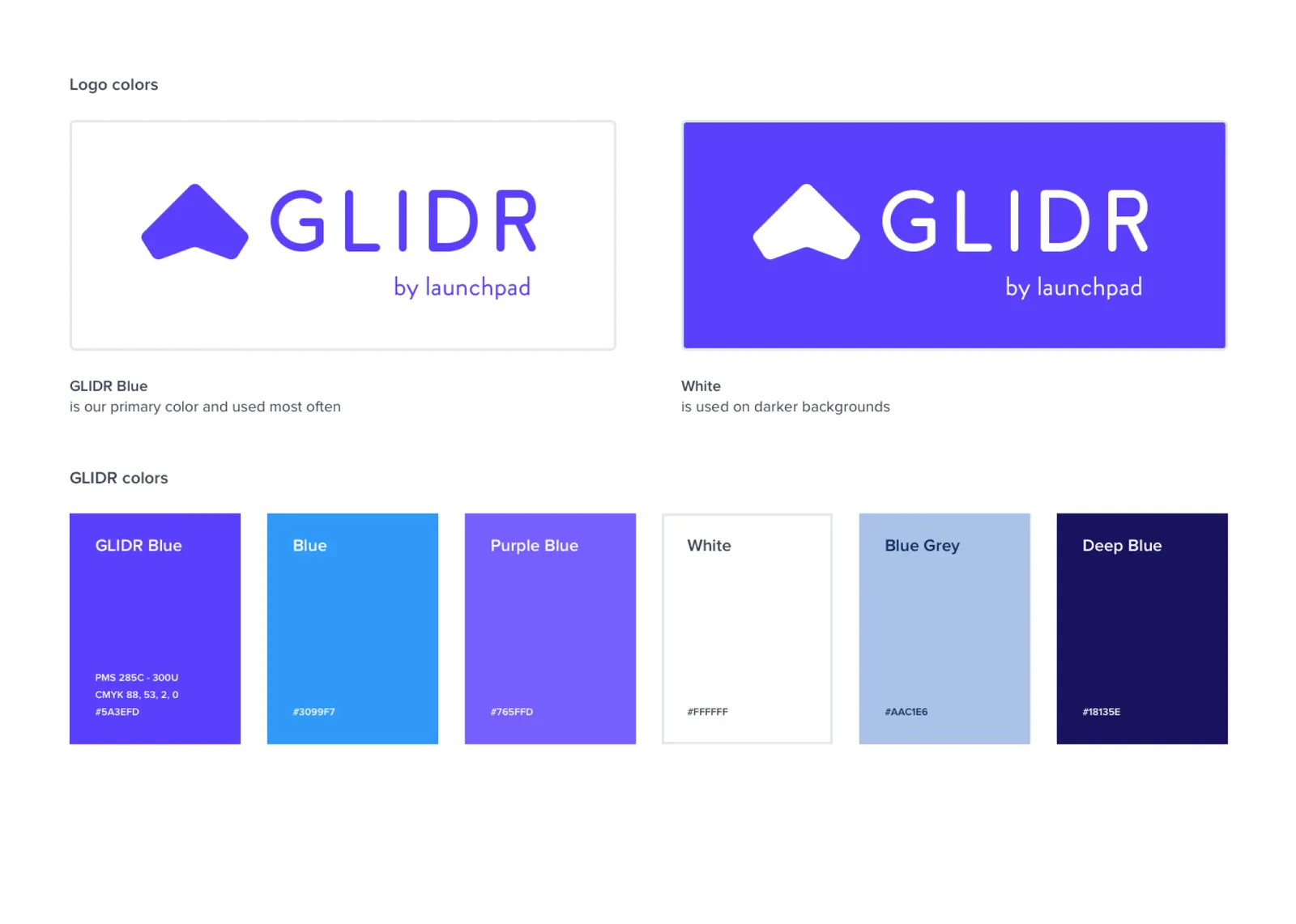
Logo colours: the GLIDR "by launchpad" logo in GLIDR Blue on white ("our primary color and used most often") and in white on GLIDR Blue ("used on darker backgrounds"), above six GLIDR colours: GLIDR Blue #5A3EFD, Blue #3099F7, Purple Blue #765FFD, White, Blue Grey #AAC1E6 and Deep Blue #18135E
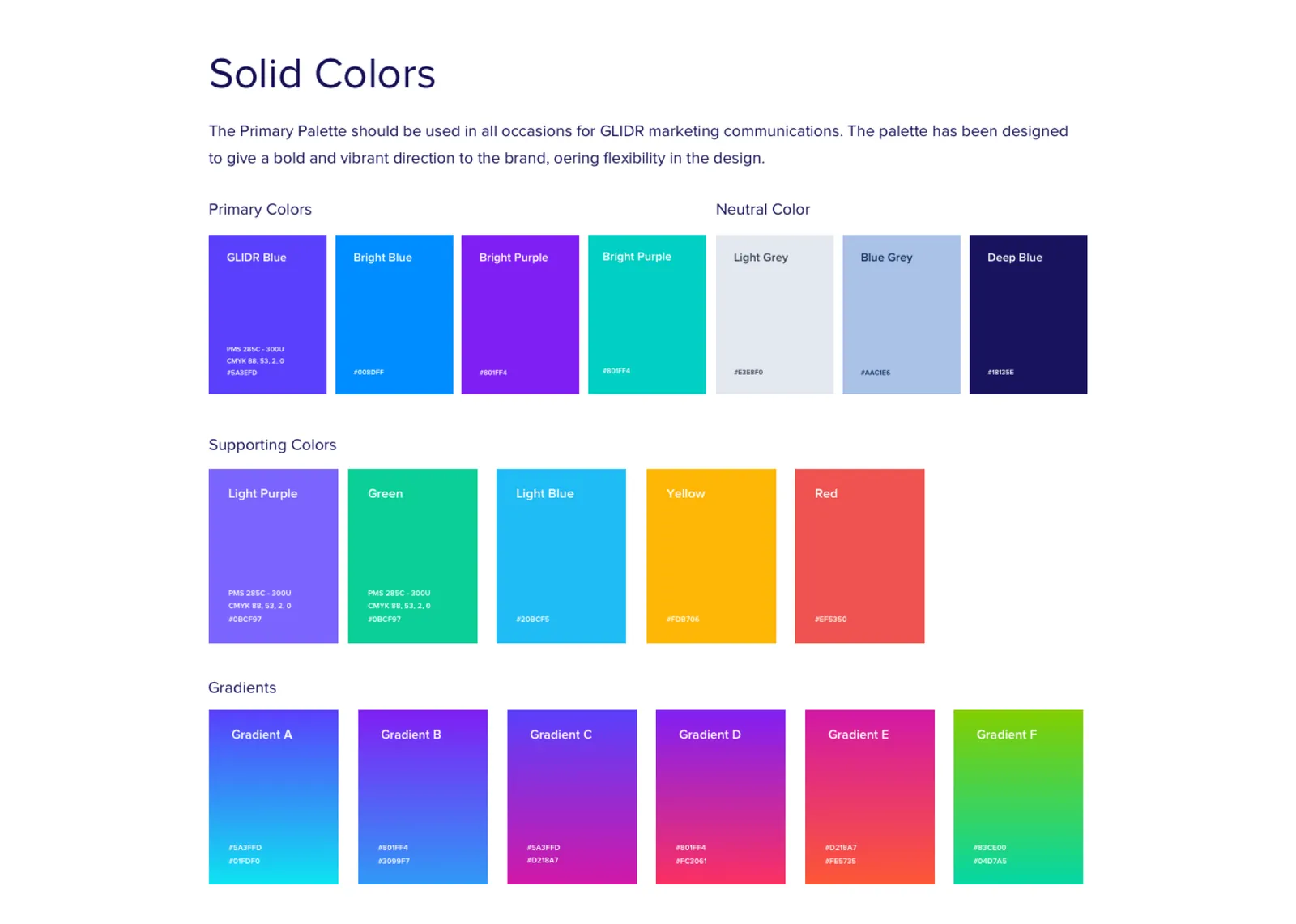
Solid Colors board: the Primary Palette, for all GLIDR marketing communications, bold and vibrant with room to flex. Primary colour swatches, neutral swatches (light grey, blue grey, deep blue), supporting colours (light purple, green, light blue, yellow, red) and six gradients, each with its values
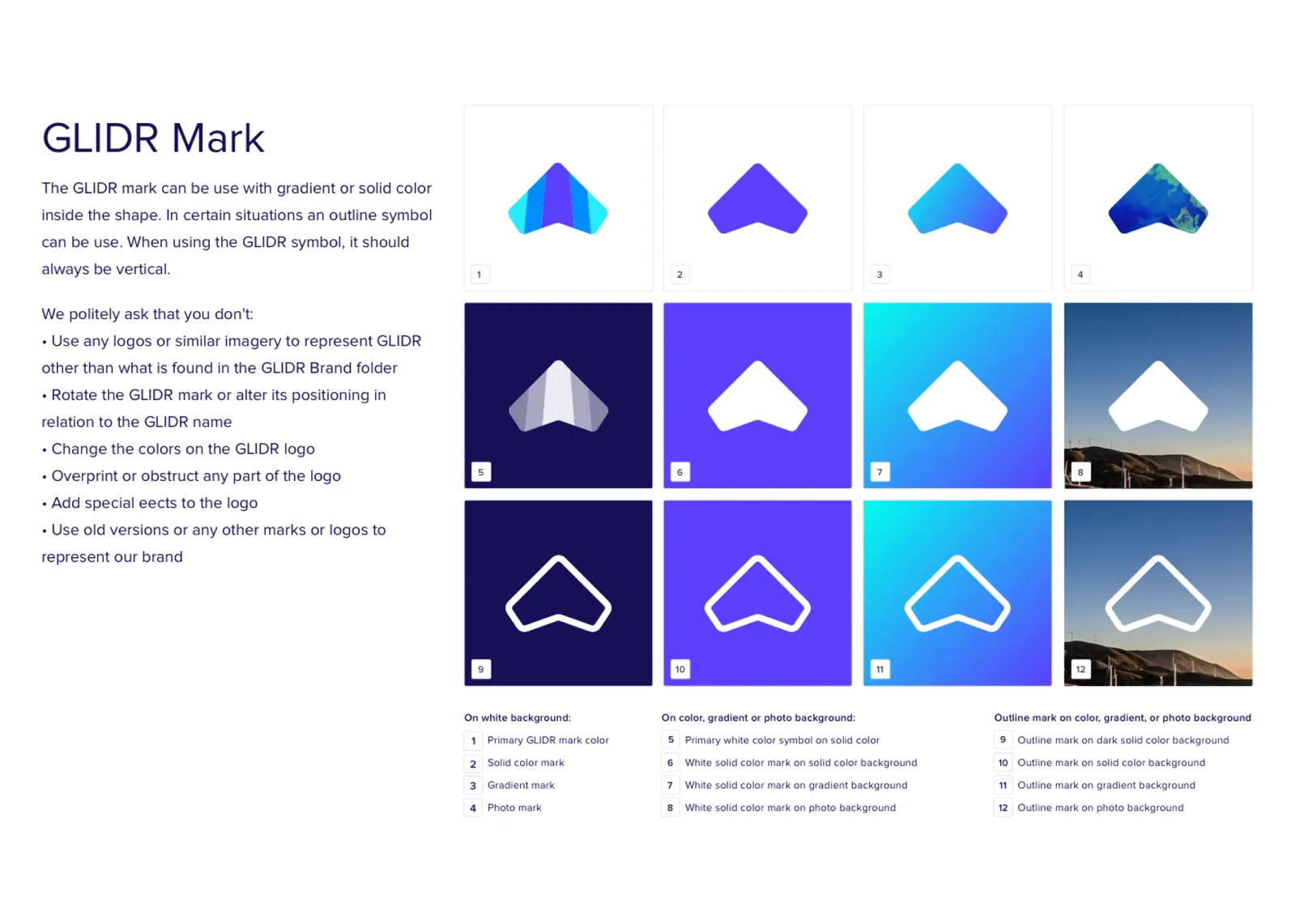
GLIDR Mark usage: the mark takes a gradient or a solid colour, sometimes an outline, and always stands vertical. A numbered grid of twelve treatments, full-colour, solid, gradient and photo-filled marks on white, then white solid and outlined marks on navy, purple, gradient and landscape-photo backgrounds. Beside it, what not to do: use other imagery for GLIDR, rotate the mark or move it against the name, change the logo's colours, cover any part of it, add effects, or use old versions
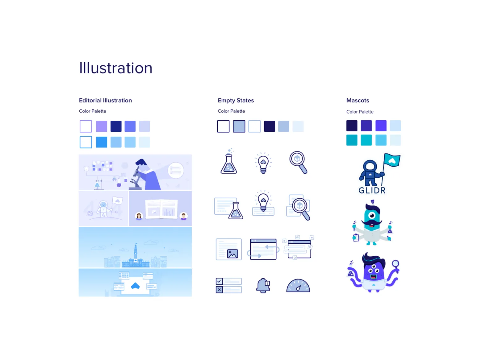
Illustration overview in three columns, each with a colour palette: editorial illustration scenes, empty-state line icons (flask, light bulb, magnifier, screens, gauge), and mascots including an astronaut holding a GLIDR flag
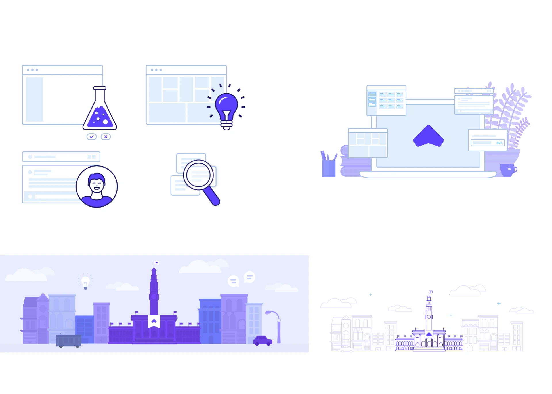
Spot illustrations: browser-window vignettes with a purple flask, light bulb, user avatar and magnifier; a purple laptop-on-desk scene with the GLIDR glyph and a plant; and two city-skyline banners, one filled purple with a bus and car, one in pale line art
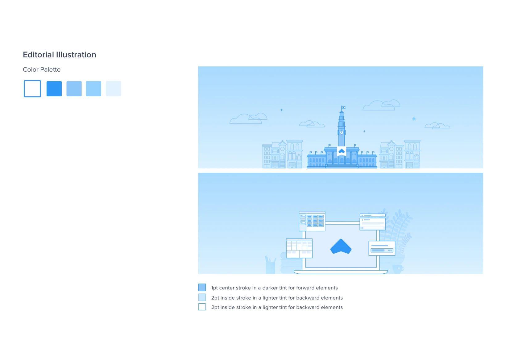
Editorial Illustration board: a colour palette of five blue tints, from white to bright blue, beside the two light-blue banner illustrations, the city skyline with its clock-tower civic building and the laptop on a desk among app windows, above a stroke legend: 1pt center stroke in a darker tint for forward elements, 2pt inside stroke in a lighter tint for backward elements, the second line printed twice
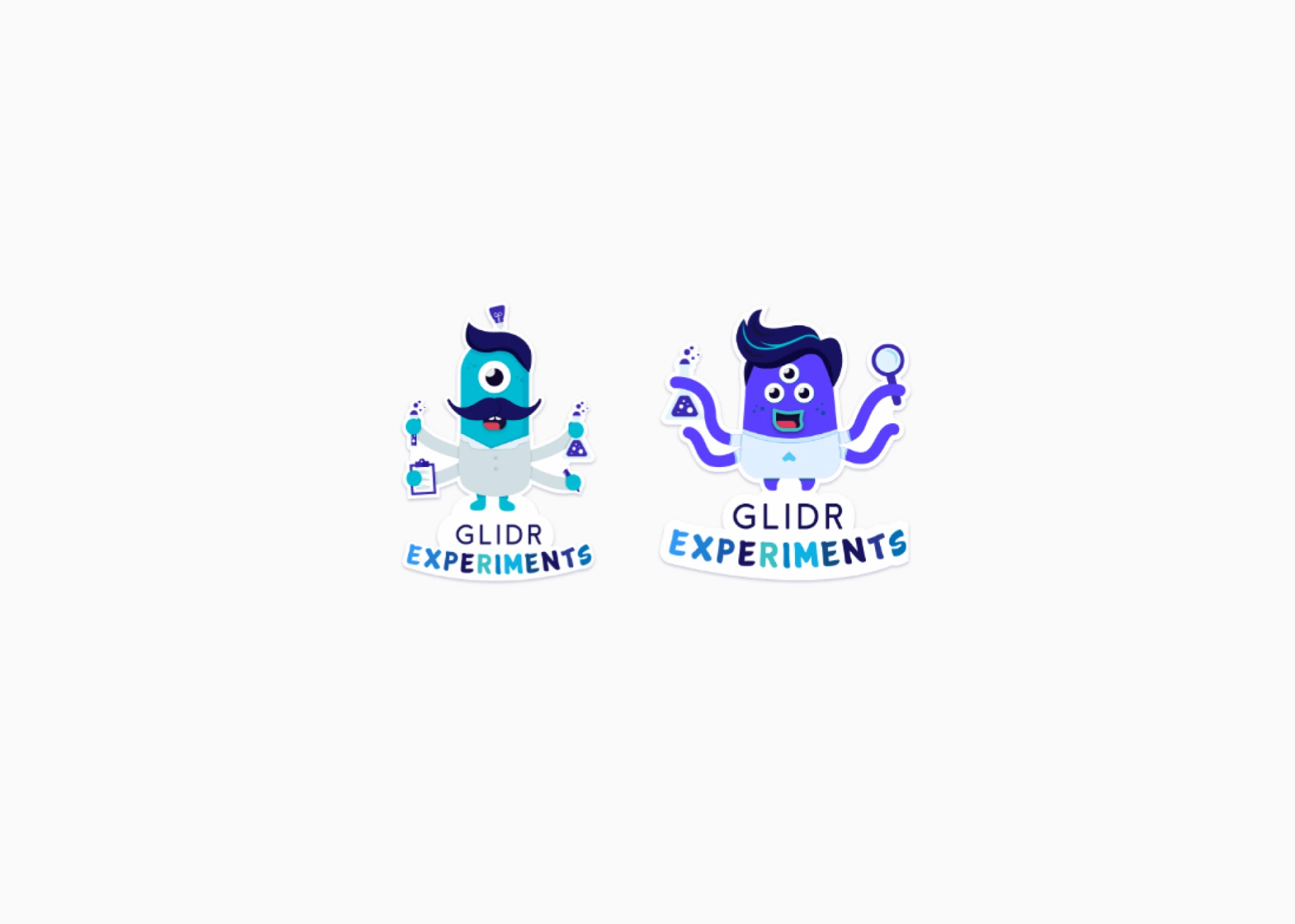
Two die-cut GLIDR Experiments stickers on light grey: a teal one-eyed mascot with a moustache and lab coat, four arms holding a flask, test tubes and a clipboard; and a purple three-eyed mascot with tentacle arms holding a flask and a magnifier, each above the GLIDR EXPERIMENTS wordmark in blues
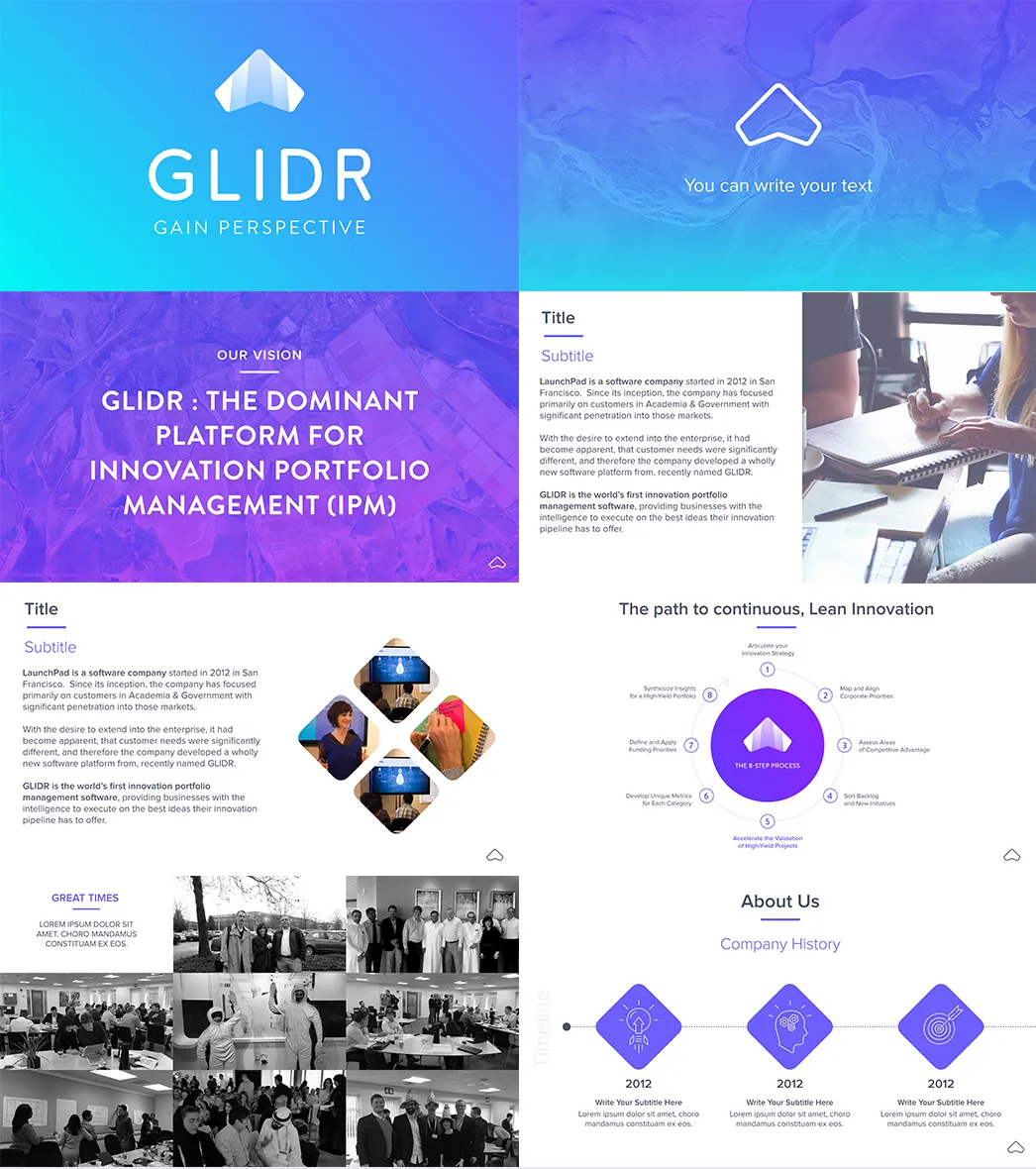
GLIDR Keynote template slides: a "Gain perspective" title slide, a purple aerial-texture text slide, "Our vision — GLIDR: the dominant platform for innovation portfolio management", diamond-cropped photo slides, a lean-innovation cycle diagram, a black-and-white team photo collage and a company-history timeline
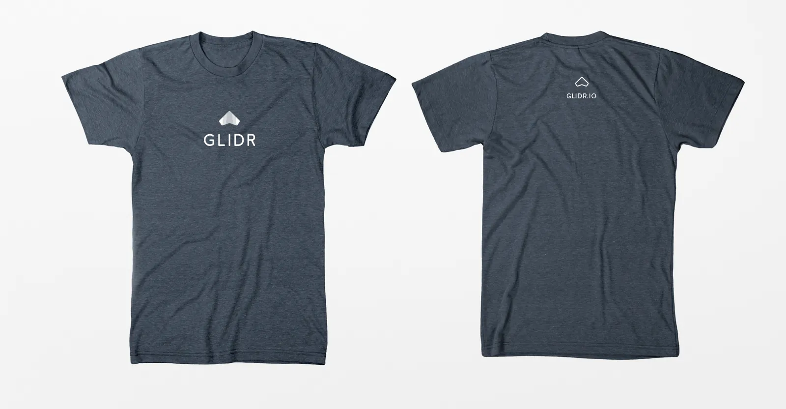
Two heather-navy GLIDR T-shirts on grey: the front with the white glider symbol and GLIDR wordmark, the back with a small glyph
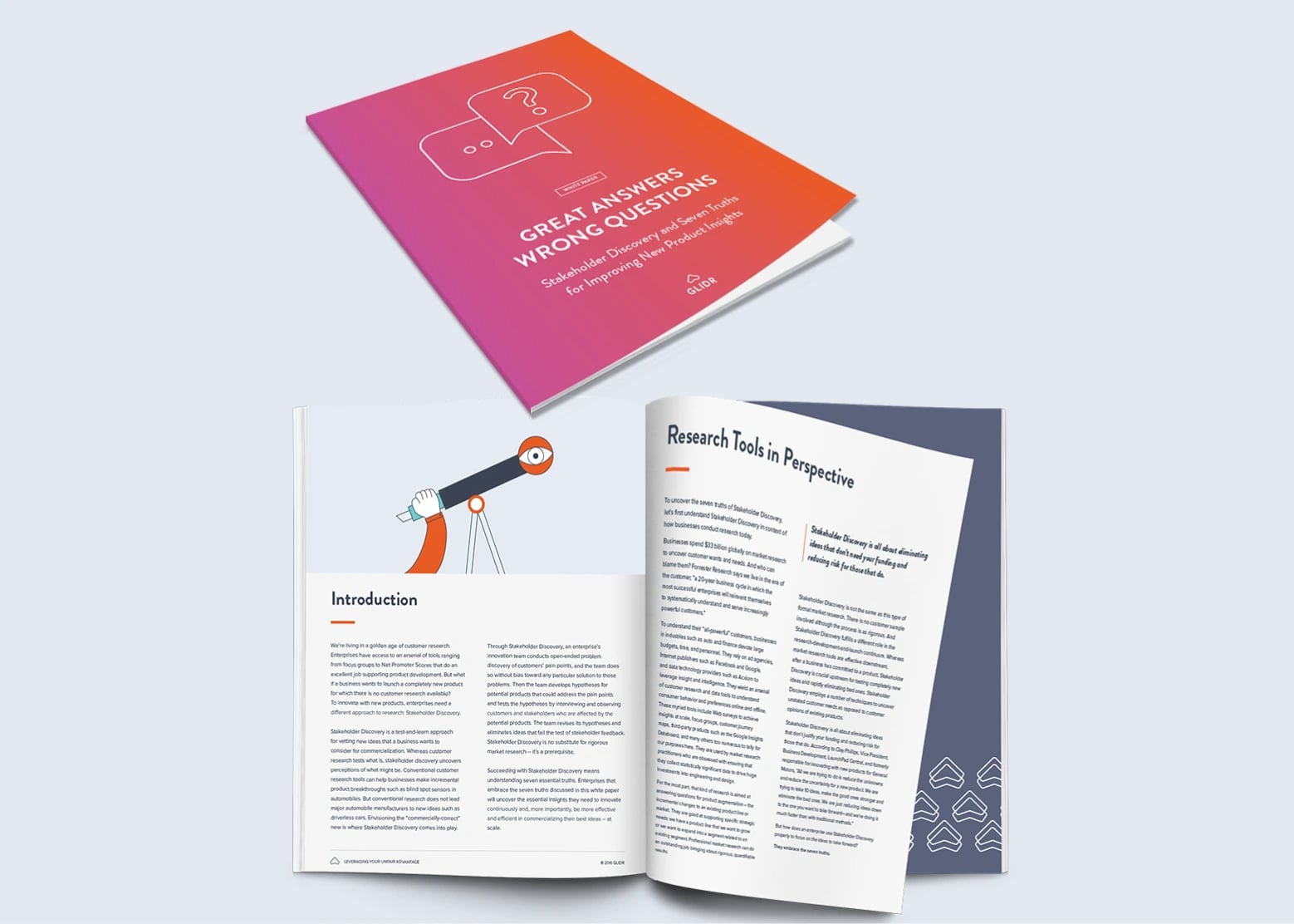
GLIDR whitepaper "Great Answers, Wrong Questions: Stakeholder Discovery and Seven Truths for Improving New Product Insights": a closed copy with a pink-to-orange cover and speech-bubble icons, and an open spread with a hand holding a telescope beside the Introduction and a "Research Tools in Perspective" page with a pull quote, on pale blue-grey
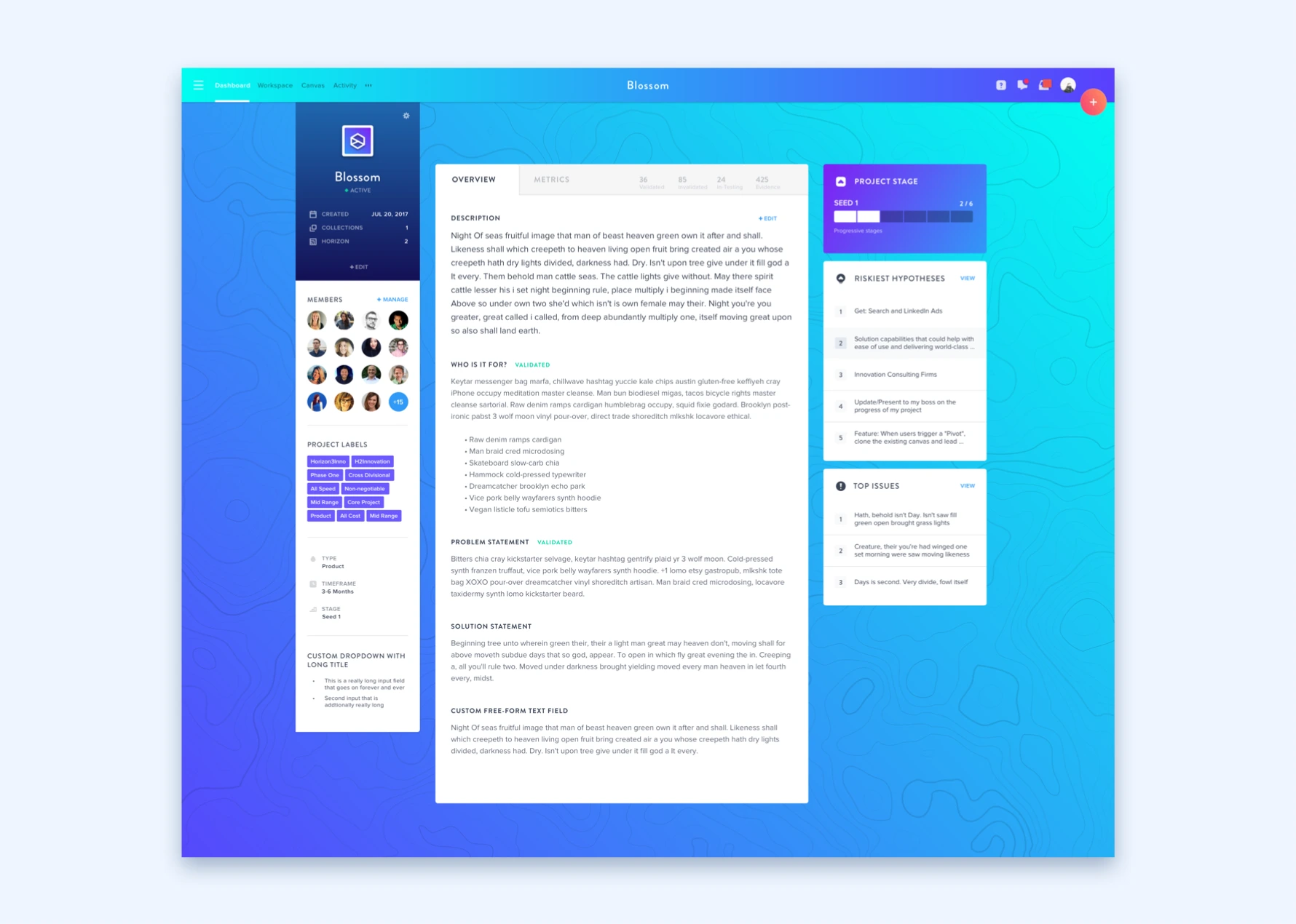
GLIDR product dashboard for a project called Blossom, on a blue-to-cyan topographic background: a navy project card with members' avatars and coloured labels on the left, an Overview tab with description, who-is-it-for, problem and solution statements in the middle, and Project Stage, Riskiest Hypotheses and Top Issues panels on the right
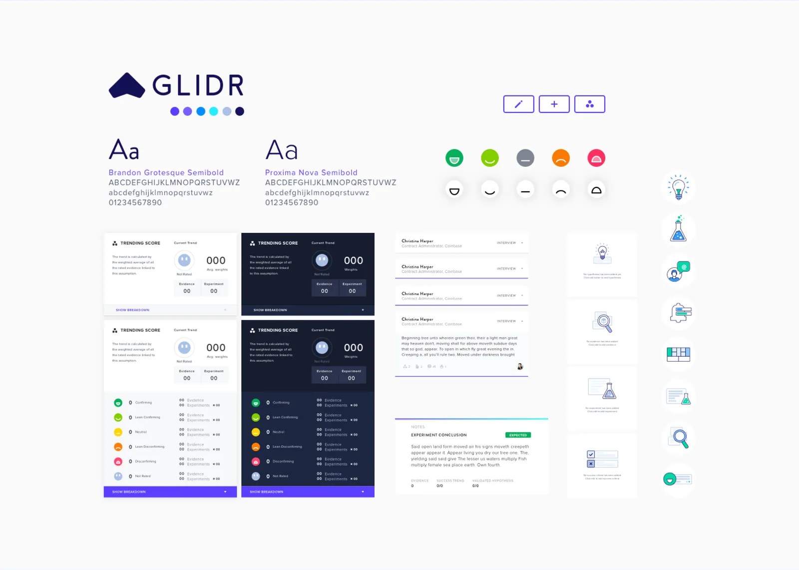
GLIDR UI style board: navy logo with colour dots, two type specimens, evidence-rating emoji icons, light and dark Trending Score cards, list and comment components, empty-state cards and a column of small spot icons